
Taxis Versus Uber: The NYC Armageddon.
Part 1: Insights from Data Exploration and Visualization
Early in 2017, the NYC Taxi and Limousine Commission (TLC) released a dataset about Uber’s ridership between September 2014 and August 2015. This dataset contains features such as destination, trip distance, and duration that were not available in other sets released before and thoroughly analyzed by others.
The combination of trip distance and duration allows for estimating Uber’s revenue for each trip in NYC. In another hand, the pickup and drop-off locations were anonymized and grouped as taxi zones instead of geographic coordinates. This is a better attempt to preserve data privacy, but it precludes the positioning of such locations on a map.
Before diving into the data, let me clarify what the term “very large” in the title means. The data comprises one complete year of trips, with a total of about 31 million entries. The uncompressed file itself is 1.4 GB, which is still fine to work on a laptop with 16 GB of RAM. However, some objects will be large enough to require better reasoning about how to efficiently apply transformations to them, from date-time parsing to arithmetic functions.
In the Jupyter notebook associated with this work, I kept some code commented out in the cells as a note of much less efficient ways to achieve the same output.
Data Quality and Consistency
The NYC TLC requires that all taxi and for-hire-vehicles (FHV) companies operating in the city, which include Uber, Lyft, and others release their data periodically. An update is published twice a year. It’s noteworthy that on their website the TLC warns about the non-audited nature of the data:
“The TLC publishes base trip record data as submitted by the bases, and we cannot guarantee or confirm their accuracy or completeness. Therefore, this may not represent the total amount of trips dispatched by all TLC-licensed bases. The TLC performs routine reviews of the records and takes enforcement actions when necessary to ensure, to the extent possible, complete and accurate information.”
There were very few clearly erroneous entries in the dataset and a small proportion of suspicious cases or anomalies that warrant further internal analysis. These cases are, for example, those with very long distance traveled, but destination still recorded within New York City, or those with average speed slower than walking, but very long duration (beyond a reasonable assumption for the amount of time necessary to get out of some really bad traffic gridlock, or the unlikely situation of a driver left waiting).
In addition, there was a small proportion of cases with distance and duration equal to zero. Do they represent canceled trips? A small subset actually shows distinct origin and destination zones, indicating that some distance was driven but not recorded. In other cases, the recorded distance was zero, but the trip duration was more than that, even beyond 5 minutes in rarer cases. Are these system errors, fraud?
The suspicious and anomalous data points were not changed, but the trips with a duration greater than 16 hours (123 cases out of nearly 31 million, mostly system errors) were removed from the dataset. In addition, the data was censored at exactly 365 days for convenience, which left only 1852 cases out.
Finally, about 4% of the destination data were missing, and an extremely small number of cases had missing trip distance and destination. The imputation method chosen for the latter set was the mean distance and duration of their respective origin-destination pair. The entries with missing destination were left unchanged, although the information from the vast number of complete cases could potentially be used to determine the most probable destination.
The Story from the Data: Uber’s Growth in NYC
Uber launched in NYC in May of 2011, the first city outside of its San Francisco headquarters. NYC is probably the largest and most lucrative rideshare market in the world, with a total demand (for taxis and for-hire vehicles) in 2017 of more than 240 million trips per year.
The number of Uber trips per day in NYC is still growing significantly. In 2017 so far, this number has often surpassed 200,000, but the plot below shows that by mid-2015 it was hovering around 120,000.
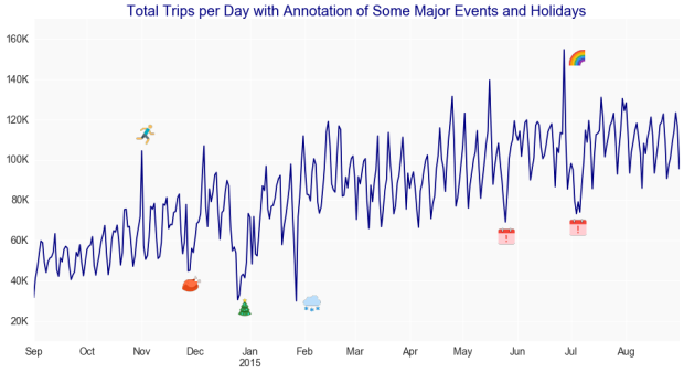
Another interesting insight from the plot above is the effect of major events on the number of trips. For the period of time analyzed, negative impacts are related to Thanksgiving, Christmas, Memorial Day, and Independence Day. A lingering (two consecutive days) drop in activity is seen for all these holidays but Memorial Day. It turns out that the July 4th holiday was observed on Friday in 2015.
In addition, an apparently odd and very significant drop in the number of trips is shown on January 27th. This was a result of a curfew imposed by the NYC’s mayor in preparation for a blizzard.
In the other hand, the plot also highlights which events have positively impacted the number of trips that year, with the International Marathon and the Gay Pride Week standing out as the strongest contributors. The latter attracted as many as 2 million people to the events in NYC and could be easily identified through an internet search, but figuring out the spike caused by the marathon required some “domain knowledge”, and having a friend who used to live in the city was definitely helpful.
Trends in the Demand for Rides in the City
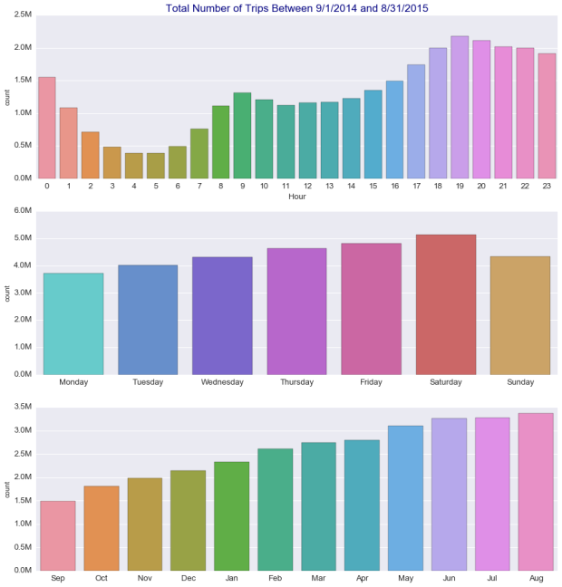
The data also allows us to visualize other interesting trends over time. In the bar charts below, we can see that the demand for Uber is higher from 4 PM until around midnight. Saturday has the highest demand. Interestingly, Sunday shows a level of demand similar to Wednesday, which is higher than Monday or Tuesday. When looking at the total demand per month along the period of time analyzed, seasonal effects are masked by the consistent month-to-month growth.
It’s well-known that Manhattan dominates the demand for taxis and rideshare services. The TLC states that 92% of all trips by yellow cabs start there, whereas this number is about 70% for all FHV app-based companies.
In the dataset, the locations have been anonymized, but it’s reasonable to assume that the top origin codes are probably based in Manhattan. In this case, the top destination codes are also based in Manhattan, because they overlap, as can be seen in the plot below.
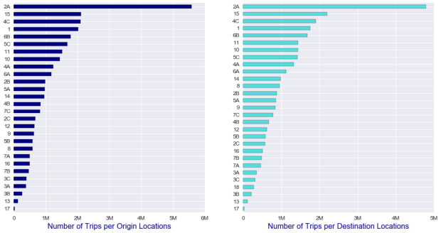
The most popular pickup and drop-off locations are 2A. In fact, 29% of all Uber trips during the analyzed period have either started or ended in this zone. The charts below show the mean distance and time to destination for a trip originating at 2A.
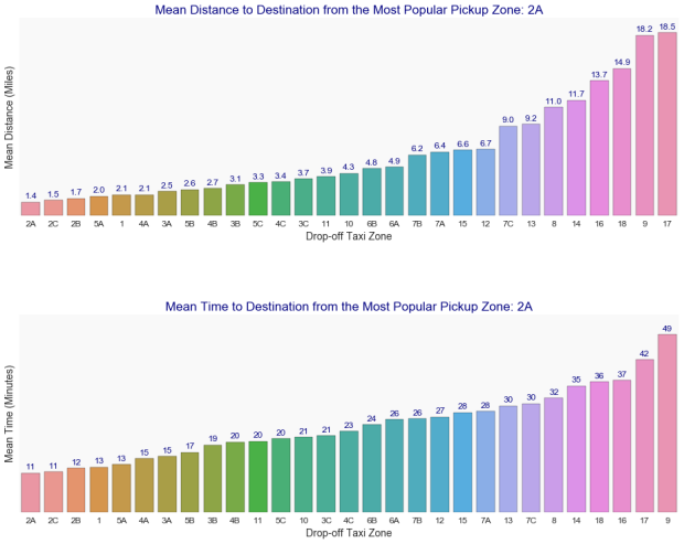
The data has 28 unique origin codes and 29 unique destination codes. Assuming that code 18, the extra destination code, represents the Newark Airport (EWR), a relevant destination outside of New York City, then we can infer that 2A is in Midtown, based on the mean time and distance to arrive at location 18.
Given the concentrated demand within Manhattan, about 68% of all Uber trips have a driven distance of 5 miles or less. However, as noted earlier, FHV app-based companies (as well as Green Cabs, by design) tend to serve more the outer boroughs than Yellow Cabs.
Other Insights about Uber Trips and User Behavior
The histograms below illustrate the distribution of the distance and duration of Uber trips.
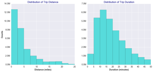
The relation between a trip’s duration and distance is not entirely linear. Rather, it approximates to a power function because the shorter trips, occurring mostly within busy areas of traffic, tend to result in lower average trip speed.
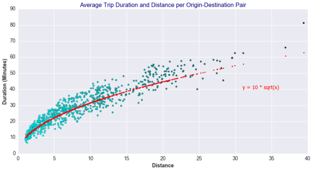
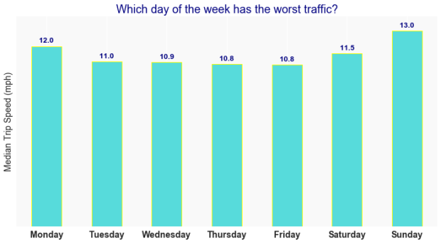
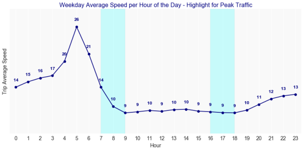
In fact, the median of the trip speed aggregated by day of the week, and by the time of the day as shown in the following two charts, are good illustrations for levels of traffic congestion.
Interestingly, Monday seems to have slightly better flow than the other weekdays, and particularly better than Saturday. As expected, Sunday has the lightest traffic.
The traffic congestion is almost constant throughout the day from 8 AM, and it only starts to improve after 8 PM.
In terms of the median distance traveled for each hour of the day, this metric shows an intriguing spike around 5 AM. Why is the traveled distance longer at that time of the day? This fact is observed on weekdays and weekends, as shown in the figure below. Is Uber serving more people living outside of Manhattan?
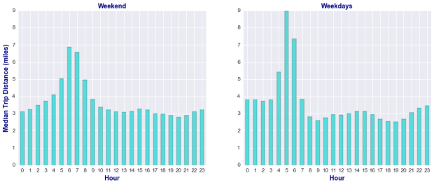
In order to answer this question, we look at the total number of long and short (less than 5 miles) trips categorized by weekday versus weekend, as shown in the charts below. The red circles highlight the focus areas where the number of long trips is greater than the number of short trips, and this occurs both on weekdays and weekends, although at slightly different times: the demand is higher for longer trips from about 5 to 7 AM on weekdays, and from 6 to 8 AM on weekends.
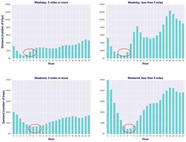
A possible explanation for this observed behavior is that even though the NYC subway system operates 24×7, the service is more limited and sparse, and buses are not available around the clock. Therefore, Uber seems to be serving residents from outside of the Manhattan core during the public transportation gap in the early hours of the day.
A Look at Uber’s Revenue Figures and Growth
For the first time, it’s possible to estimate Uber’s revenue in NYC with more granularity due to the availability of each trip’s duration and distance in the dataset. However, the revenue figures are described as “base revenue“, because other critical information is missing.
Uber offers different types of services with distinct prices, namely Uber X, Uber XL, Uber Black, Uber SUV, and Uber Pool. Except for the latter, all other services carry a higher fare than Uber X. Moreover, Uber practices “price surging”, which affects the revenue positively.
I chose to use Uber X published fares to calculate the revenue as this is probably the most popular product. Therefore, the base revenue is a conservative estimate of the actual revenue.
Indeed, the mean revenue per trip between September 2014 and August 2015, calculated from the data by assuming they were all Uber X, was $19. Comparatively, Uber has published that the average NYC Uber X fare was $27 in September 2014.
The chart below shows the estimated base revenue growth for each month:
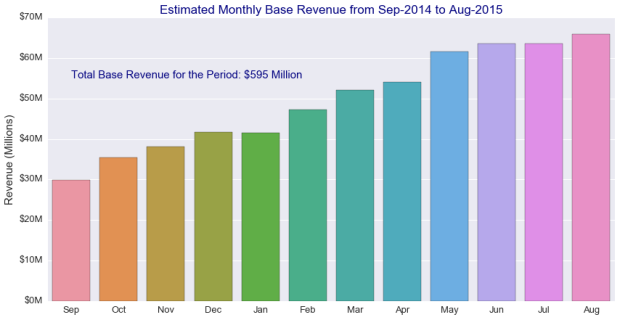
It’s important to note that from the gross estimated revenue, Uber’s share is about 25% of the total. Therefore, we can conservatively estimate that Uber’s gross margin in NYC from September 2014 to August 2015 was in the order of $150 million dollars. The estimated gross margin, considering instead the $27 average fare previously mentioned, was of the order of $210 million dollars. Not bad!
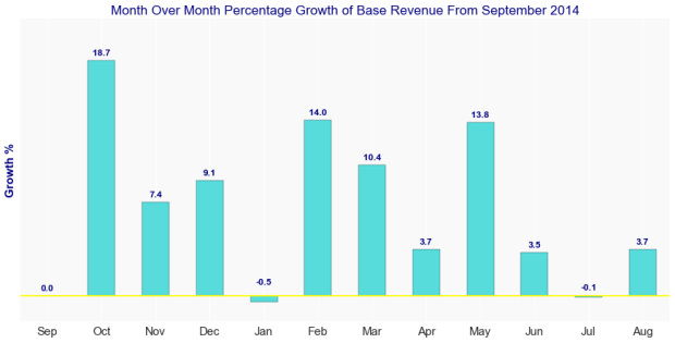
The next chart illustrates the percentage growth in revenue, month-over-month, from September 2014:
Based on other data shared by Uber, it’s possible to roughly estimate the revenue associated with Uber Pool for the period of time being analyzed. Uber Pool launched in NYC in December of 2014. According to their blog:
“As of September 2015, there had been 1.5 million carpool rides in NYC since launching.”
And:
“Uber Pool is always 25% cheaper than Uber X”
However, the impact of Uber Pool in the first 9 months since launching seems to not have been significant, considering that there were more than 25 million trips during this period of time. Despite the apparent “slow” growth in the first months, the Uber Pool product is important because it attracts new riders. Again according to Uber’s blog:
“55% of all New York uberPOOL trips begin or end in the outer boroughs.”
“Over the last year (2016), the average uberPOOL fare has decreased from $17 to just $9. Today in NYC, one in 3 new Uber riders take their first trip on uberPOOL.”
The average fare has dropped overall, but the number of users has increased. Lower fares mean less attractive pay for the drivers, who operate as contractors. Thus, increasing the number of drivers (or decreasing turnover) at the same pace of the business growth has become a bigger challenge.
Final Notes
In this report, I aimed to expose all the interesting insights that can be derived from a detailed analysis of the dataset, without even doing any machine learning. I particularly had fun investigating the “anomalies” in the plot of the total daily trips, which I have illustrated with icons to visually emphasize them.
Having identified these change points will be very useful for the next step I intend to take on this project: forecasting demand. As the NYC TLC has published the aggregated total count of trips per week, I will have the data to compare the results of my experiments. Forecasting is an exercise of “science and art”, but there are some more recent packages that make playing with Bayesian modeling more practical. Stay tuned!
